Quantifying inequality
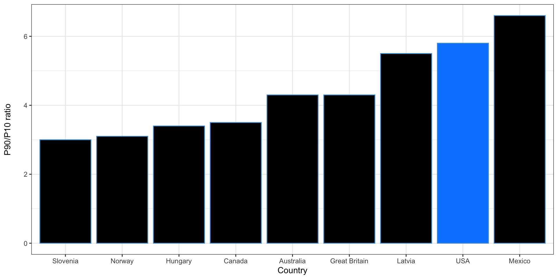
How does the US compare to other countries?
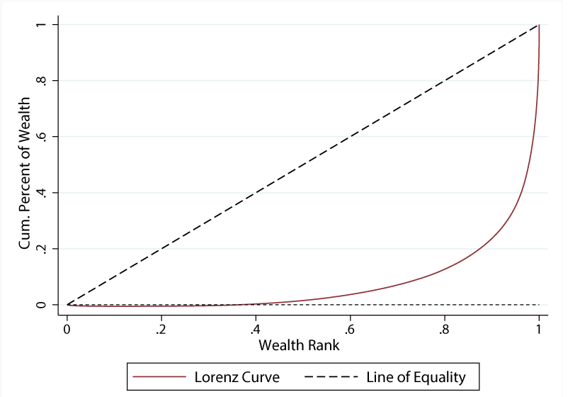
The Lorenz curve for wealth the US
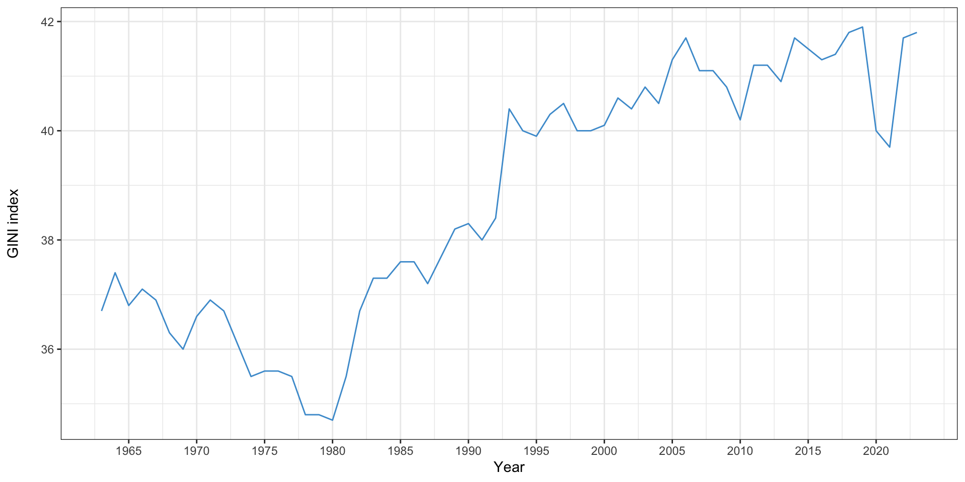
The Gini index in the US
How does the US compare to other countries?
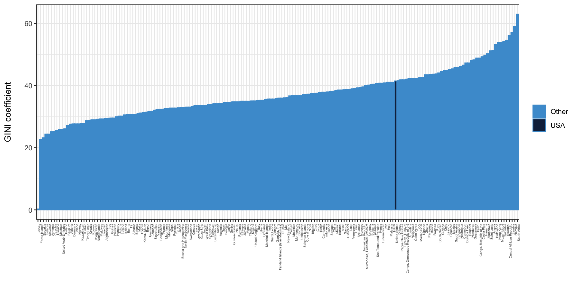
Data: CIA World Factbook
Measures of social mobility
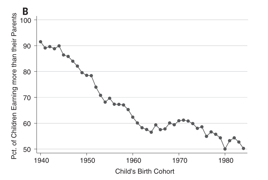
Percent of children earning more than their parents, by year of birth (Chetty et al. 2017)
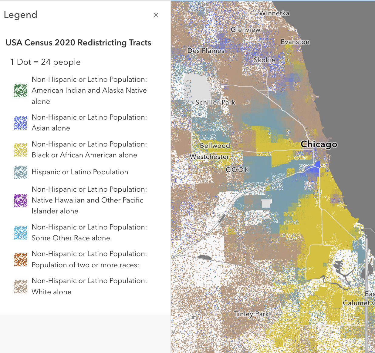
Measures of segregation
- The US remains highly segregated
- Planners and sociologists have devised a number of measures of segregation
- Formal definitions here come from Forest (2005)
References
Chetty, Raj, David Grusky, Maximilian Hell, Nathaniel Hendren, Robert Manduca, and Jimmy Narang. 2017. “The Fading American Dream: Trends in Absolute Income Mobility Since 1940.” Science 356 (6336): 398–406. https://doi.org/10.1126/science.aal4617.
Forest, Benjamin. 2005. Measures of Segregation and Isolation. Dartmouth College. https://www.dartmouth.edu/~segregation/IndicesofSegregation.pdf.
Rayle, Lisa. 2015. “Investigating the Connection Between Transit-Oriented Development and Displacement: Four Hypotheses.” Housing Policy Debate 25 (3): 531–48. https://doi.org/10.1080/10511482.2014.951674.
Schelling, Thomas C. 1978. Micromotives and Macrobehavior. January 1.

This work by Matthew Bhagat-Conway is licensed under a Creative Commons Attribution 4.0 International License.
Social mobility and the lottery effect