
Data visualization
The power of data visualizations: Anscombe’s quartet
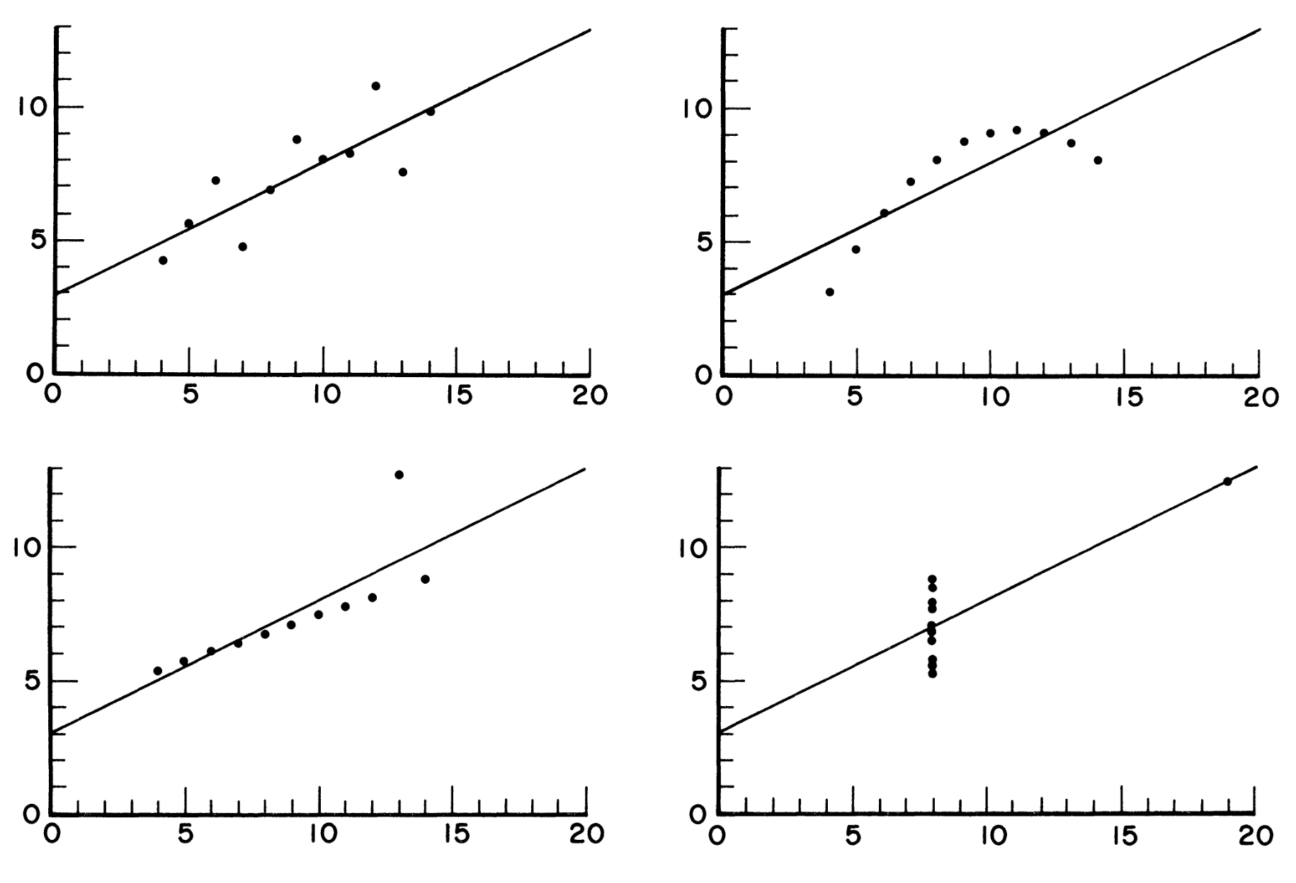
Anscombe (1973)
- These datasets all have the same means, standard deviations, correlation coefficients, regression lines, and \(R^2\)
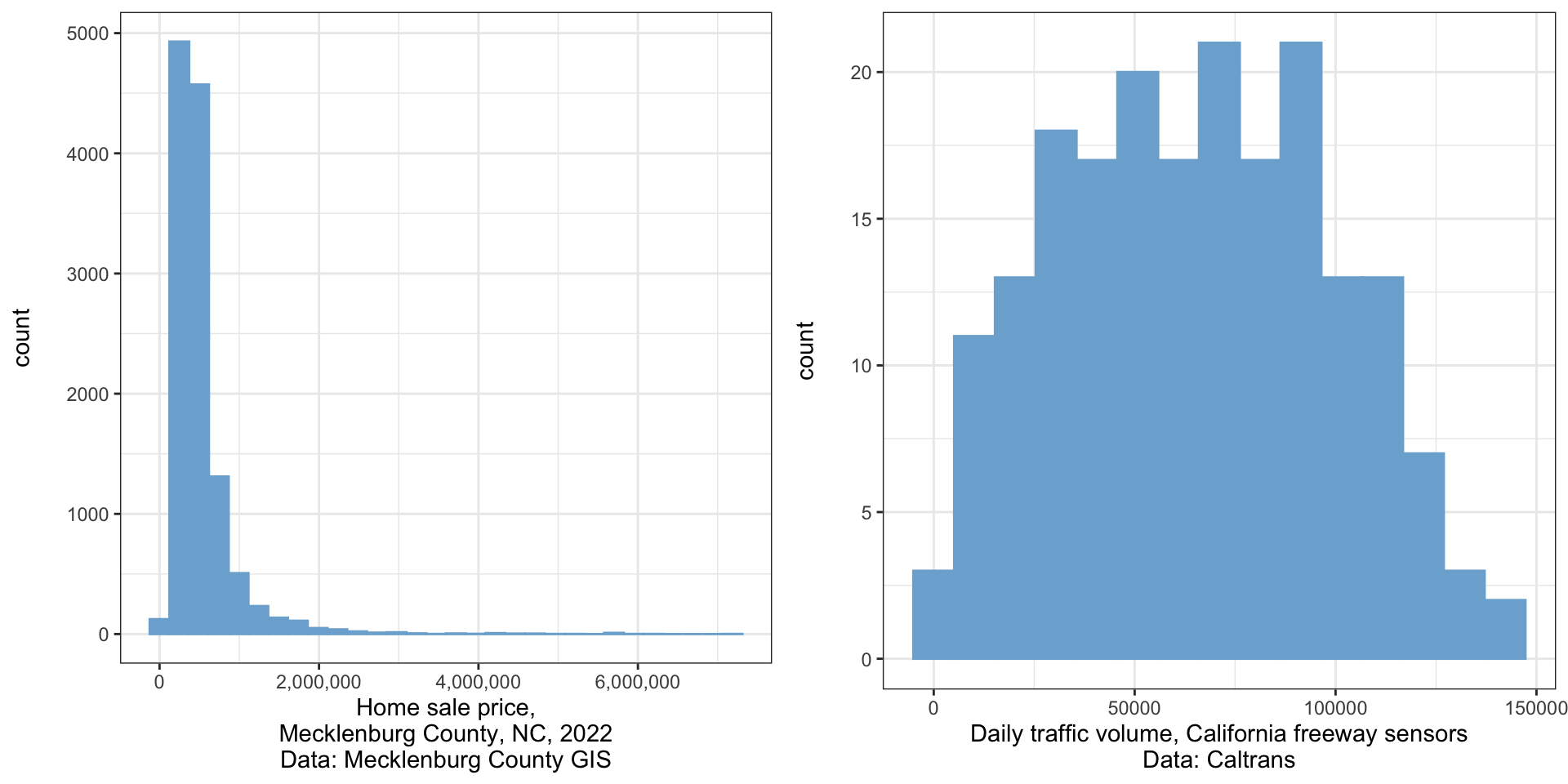
Histograms
- A histogram visualizes a univariate (one variable) distribution
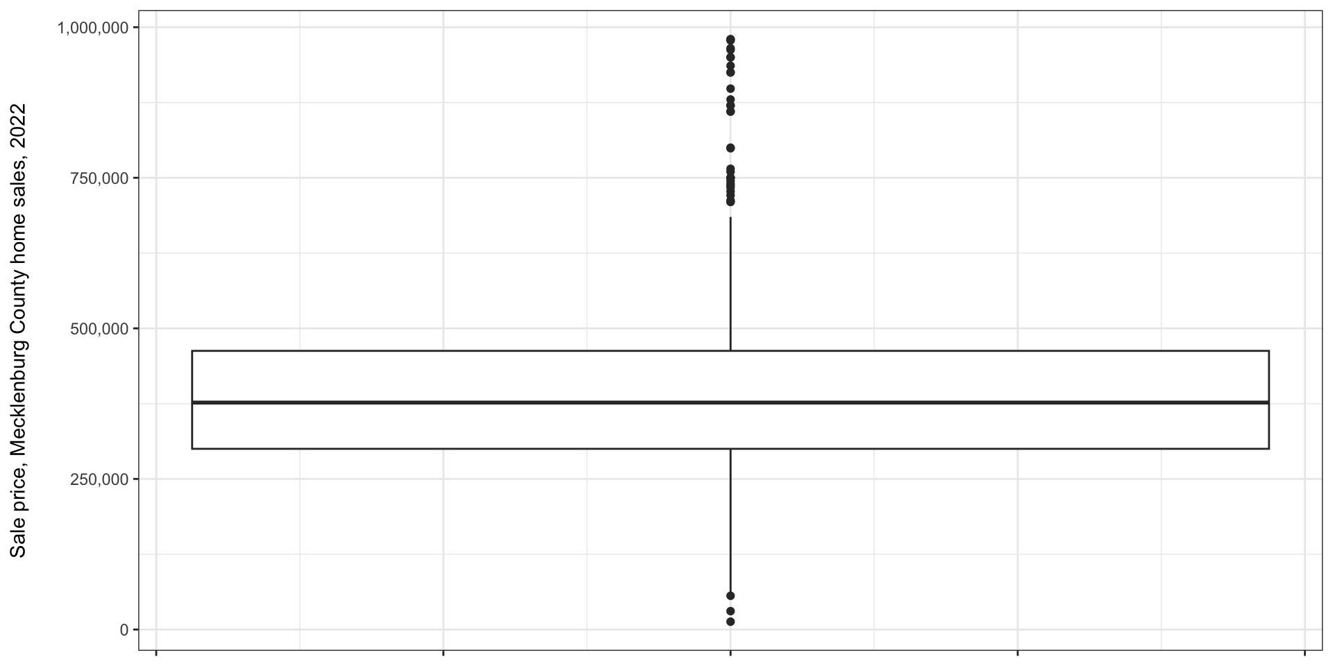
Boxplots/box and whisker plots
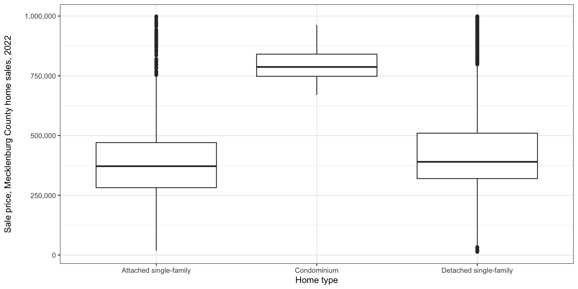
Multiple boxplots
- Often, you will see multiple boxplots presented next to one another
Scatter plots
- Used when you have two continuous variables
- Simply plot the location of each data point
- In a regression context, the independent variable is customarily on the x axis
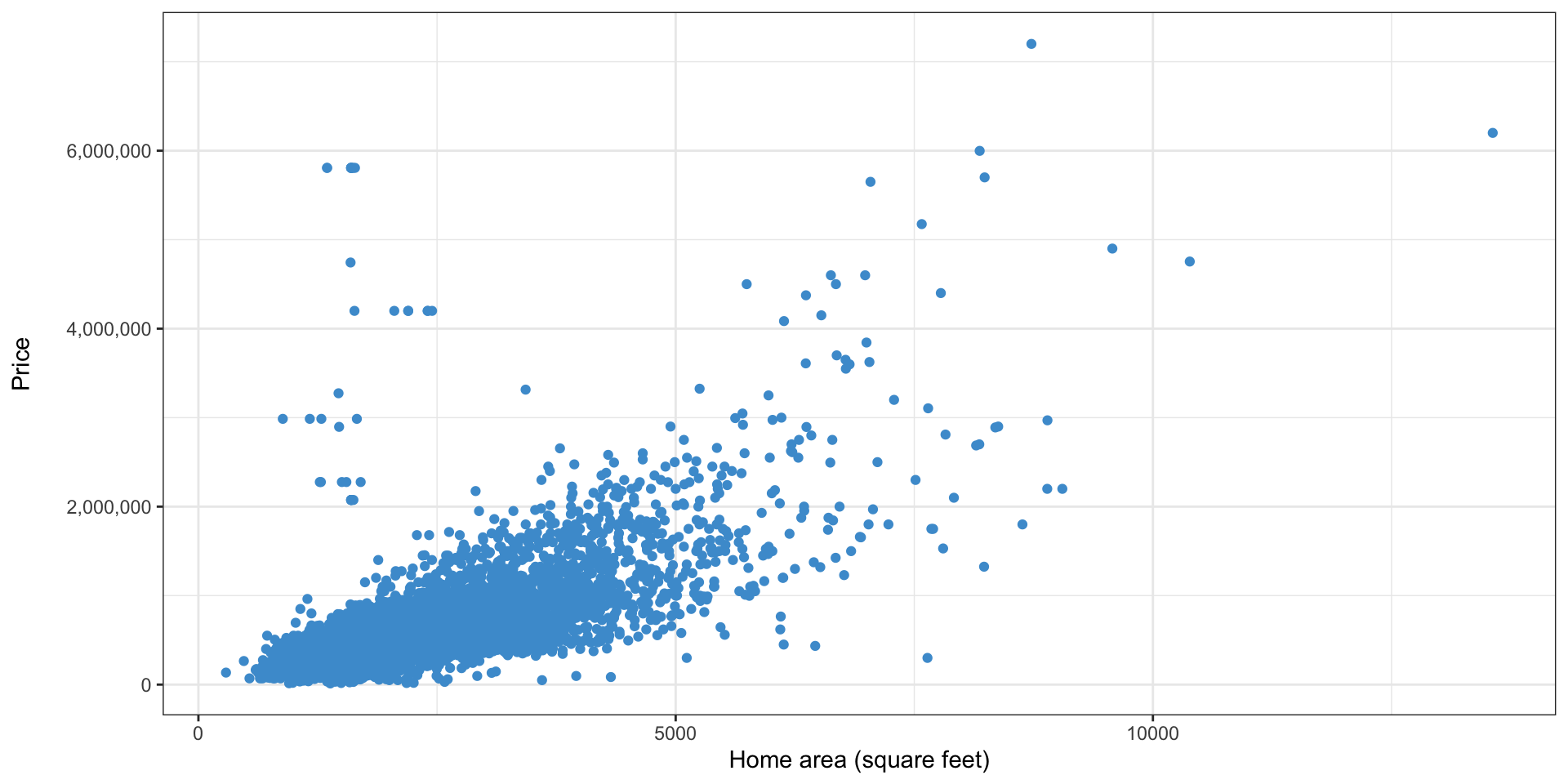
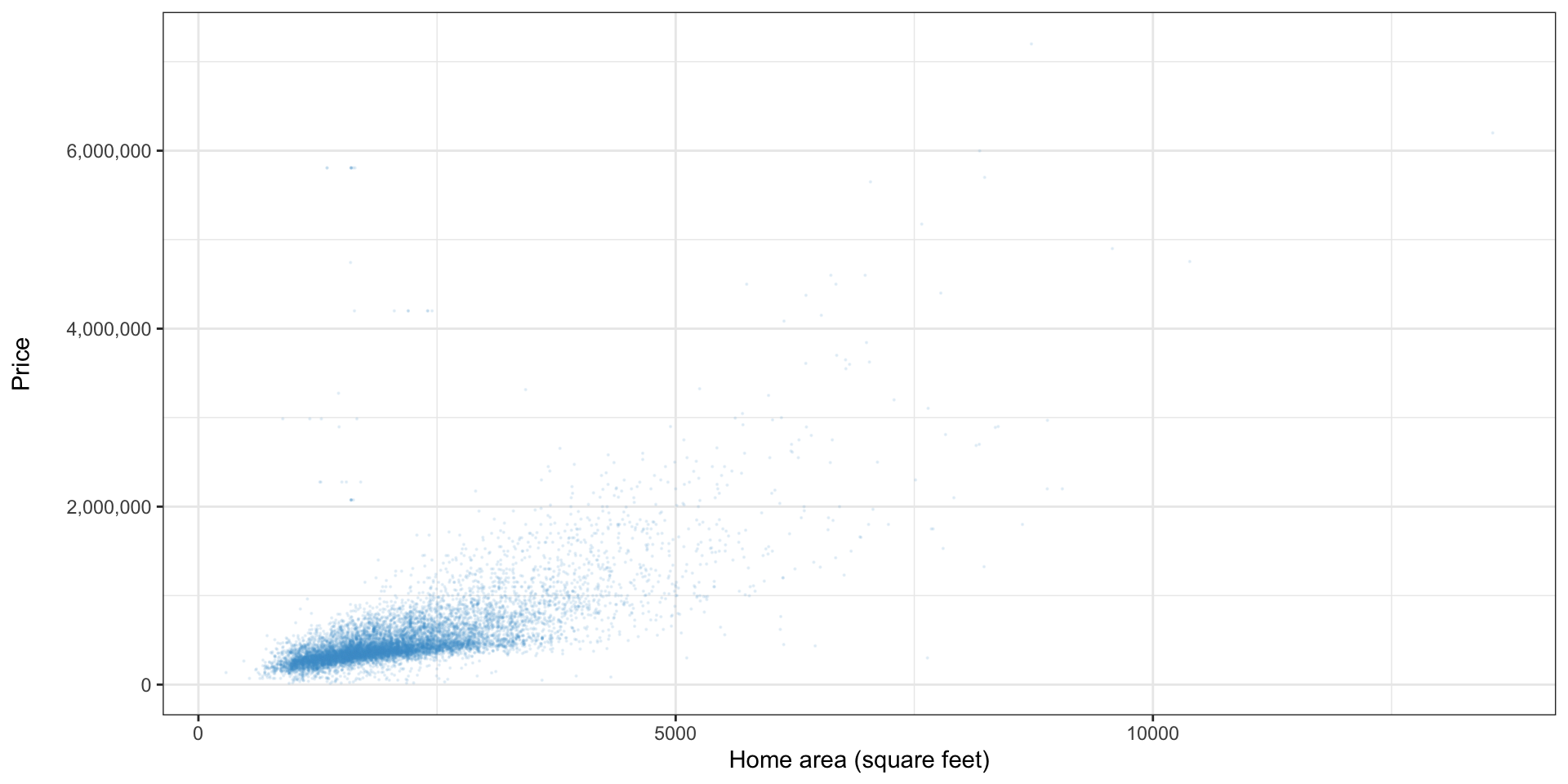
Scatter plots: other properties
- When there are many points, reducing the size or opacity can help show trends
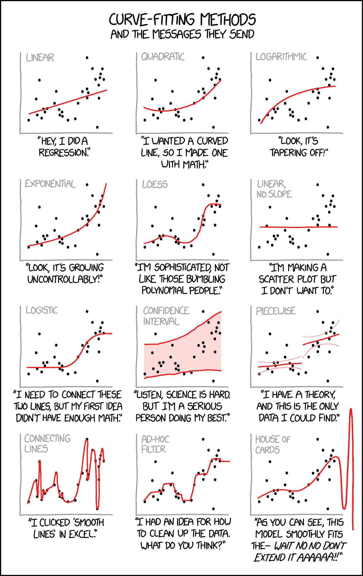
The curse of trendlines
- Excel provides many options for trendlines; don’t get carried away
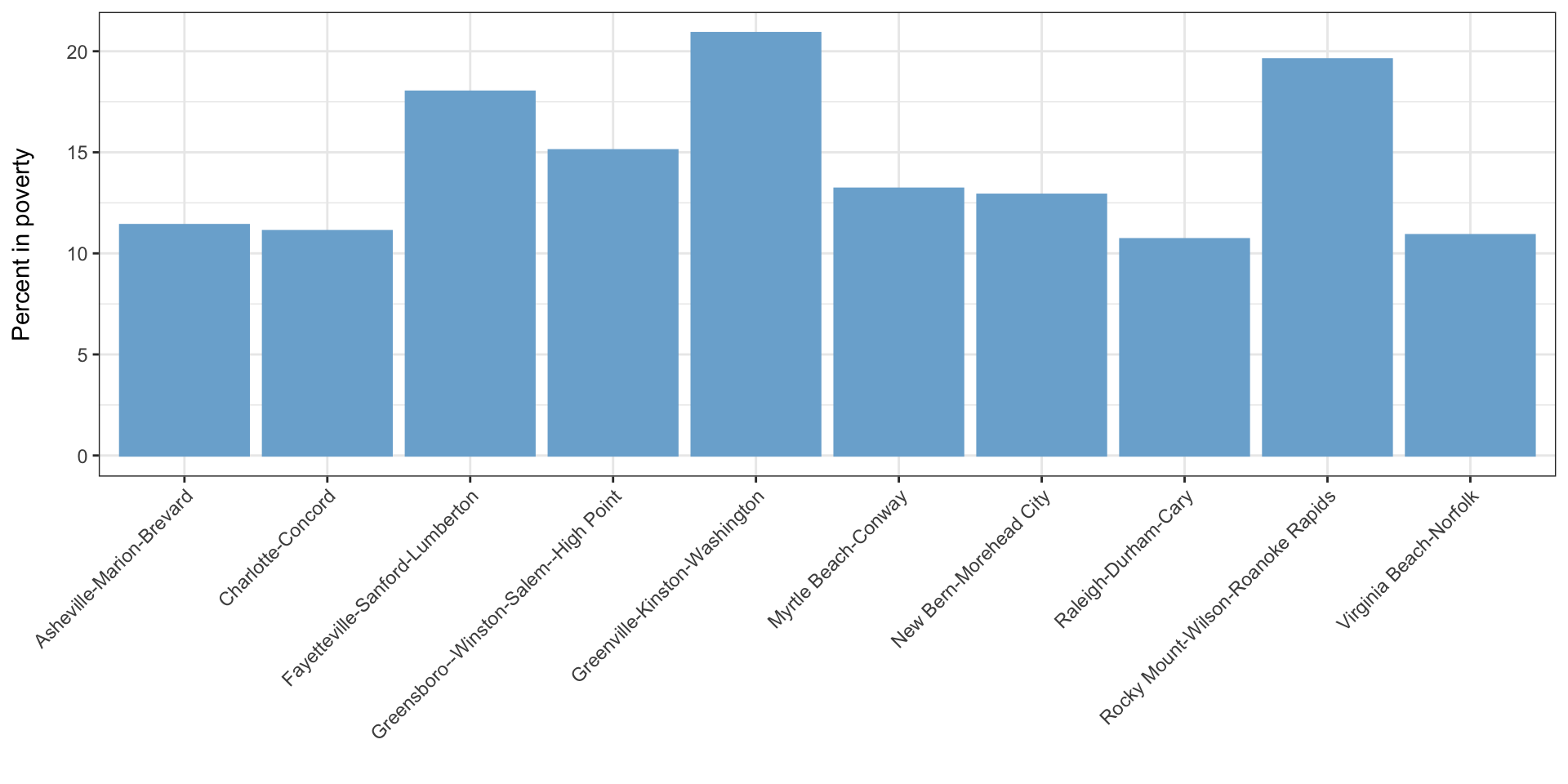
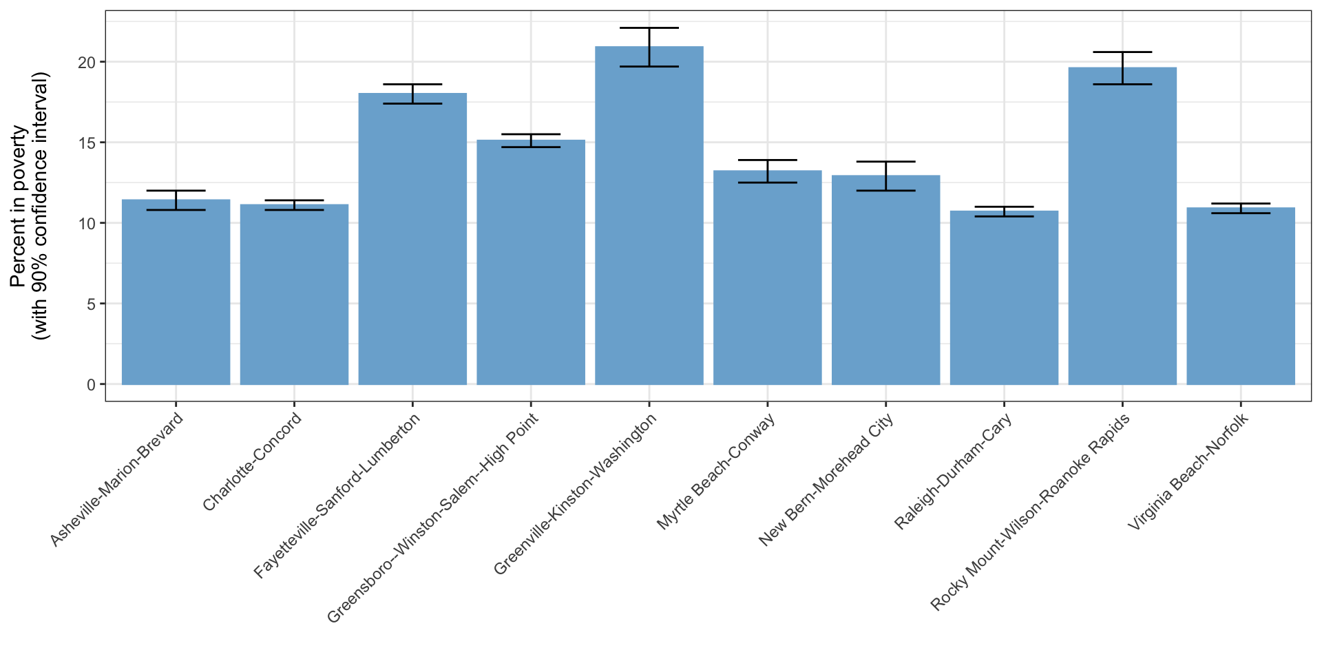
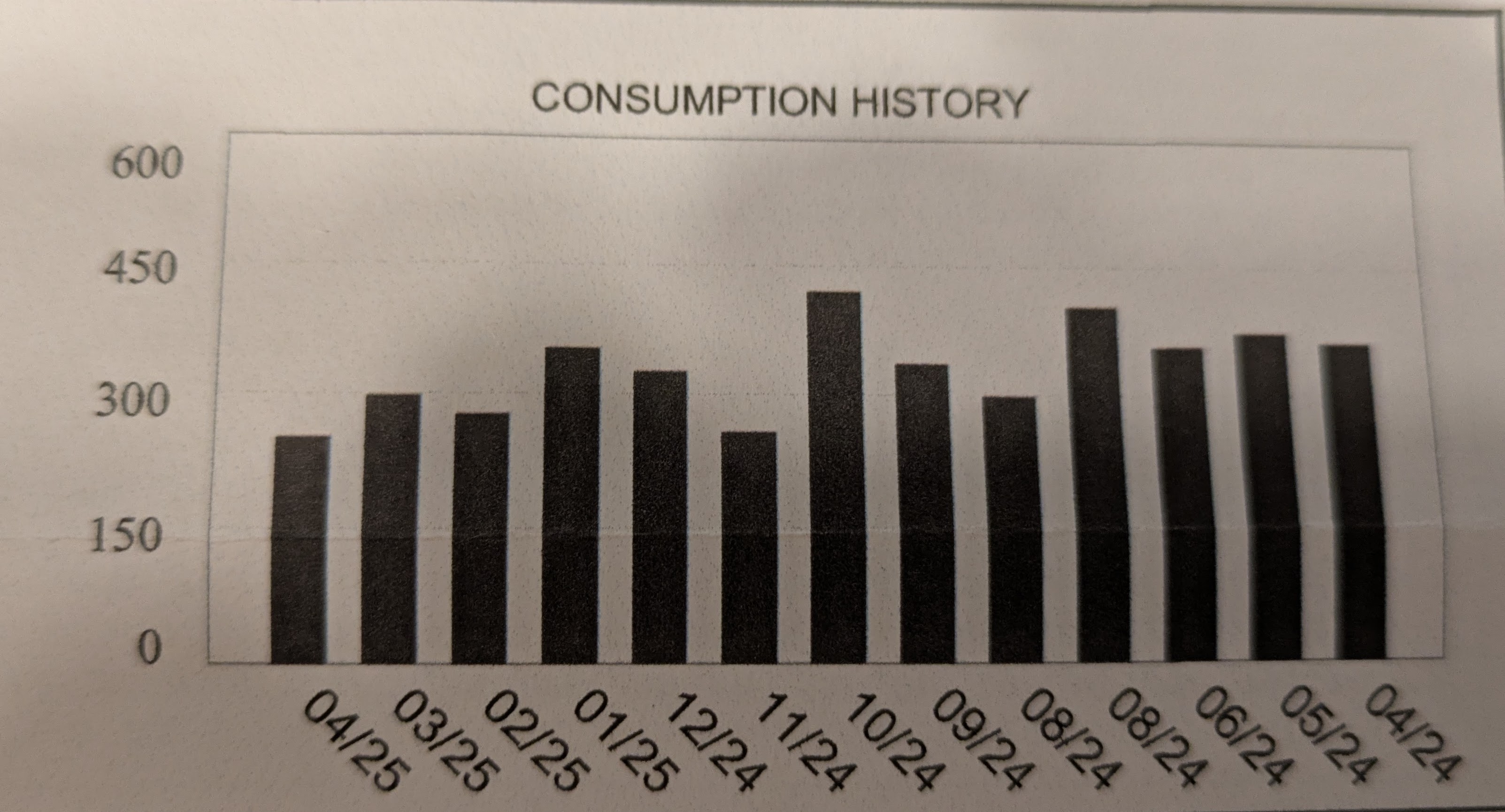
Bar charts
- Used with one continuous and one categorical variable
Error bars
- Error bars indicate a margin of error/confidence interval around the tops of the bars
- Or occasionally just the standard error - be careful here!
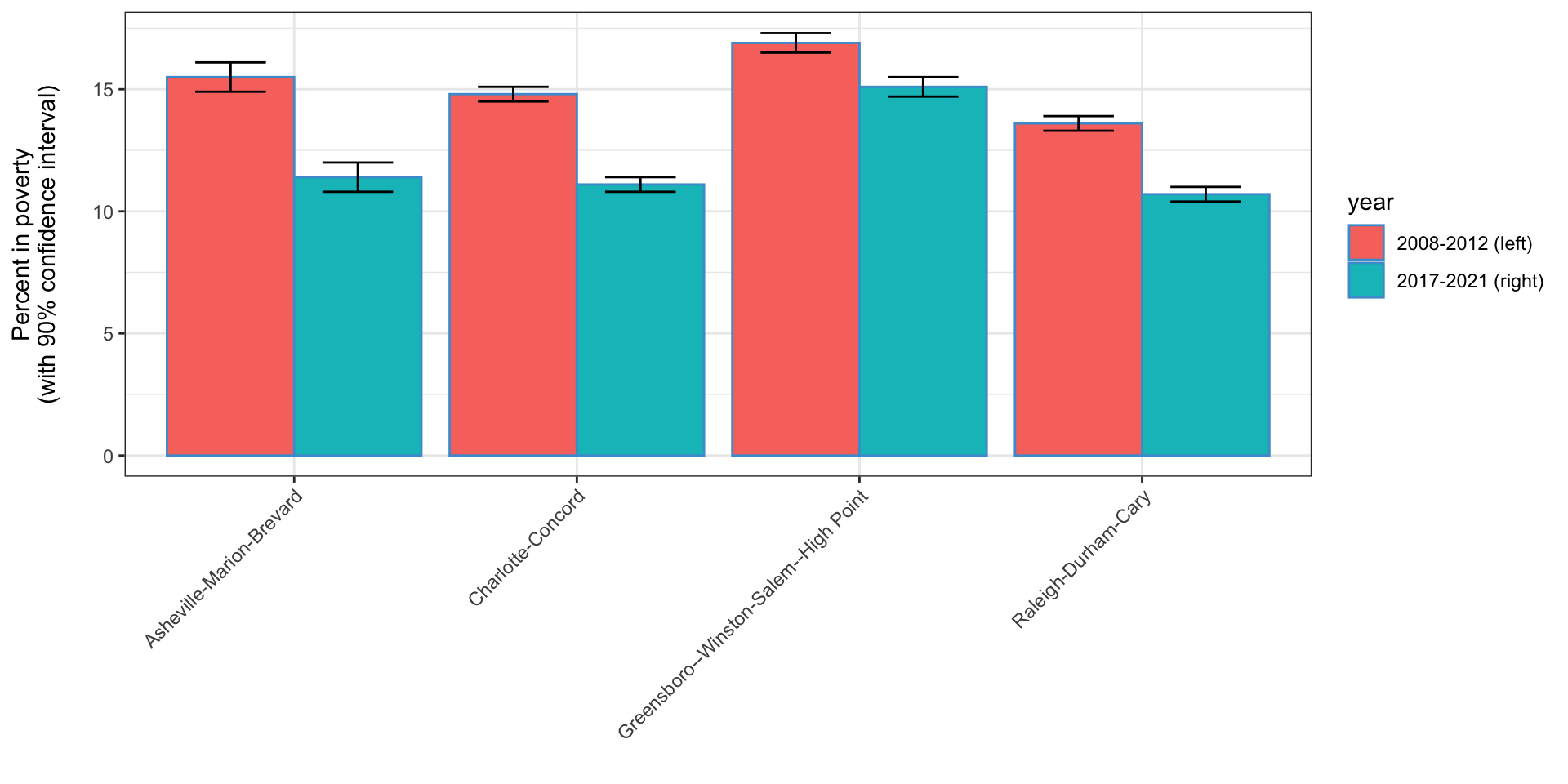
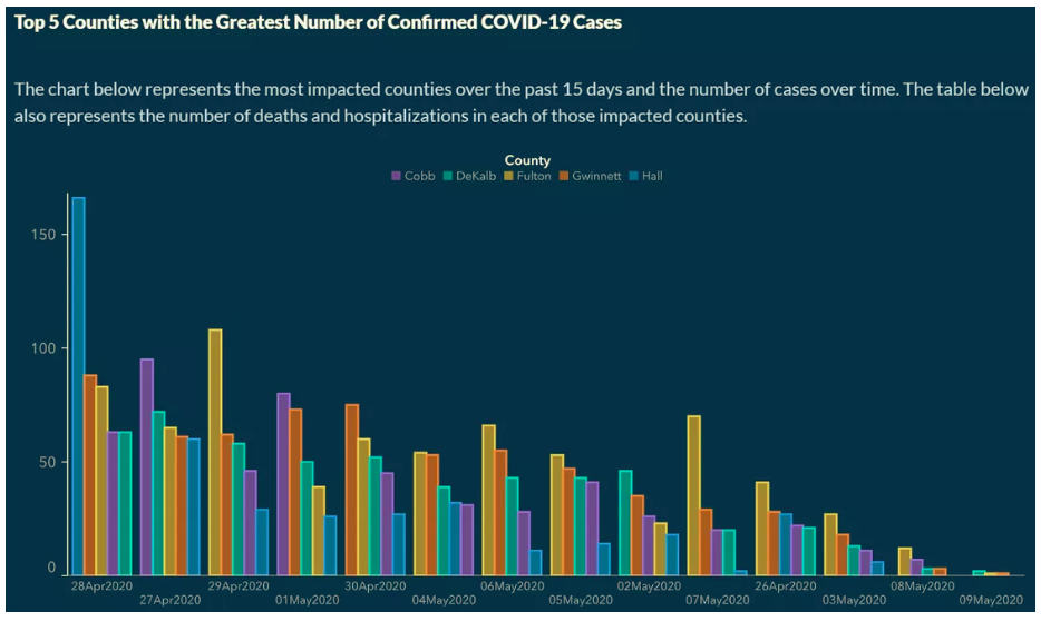
Grouped bar charts
- A common variation of the bar chart is the grouped bar chart
- Used when you want to have multiple bars associated with each \(x\)-axis value
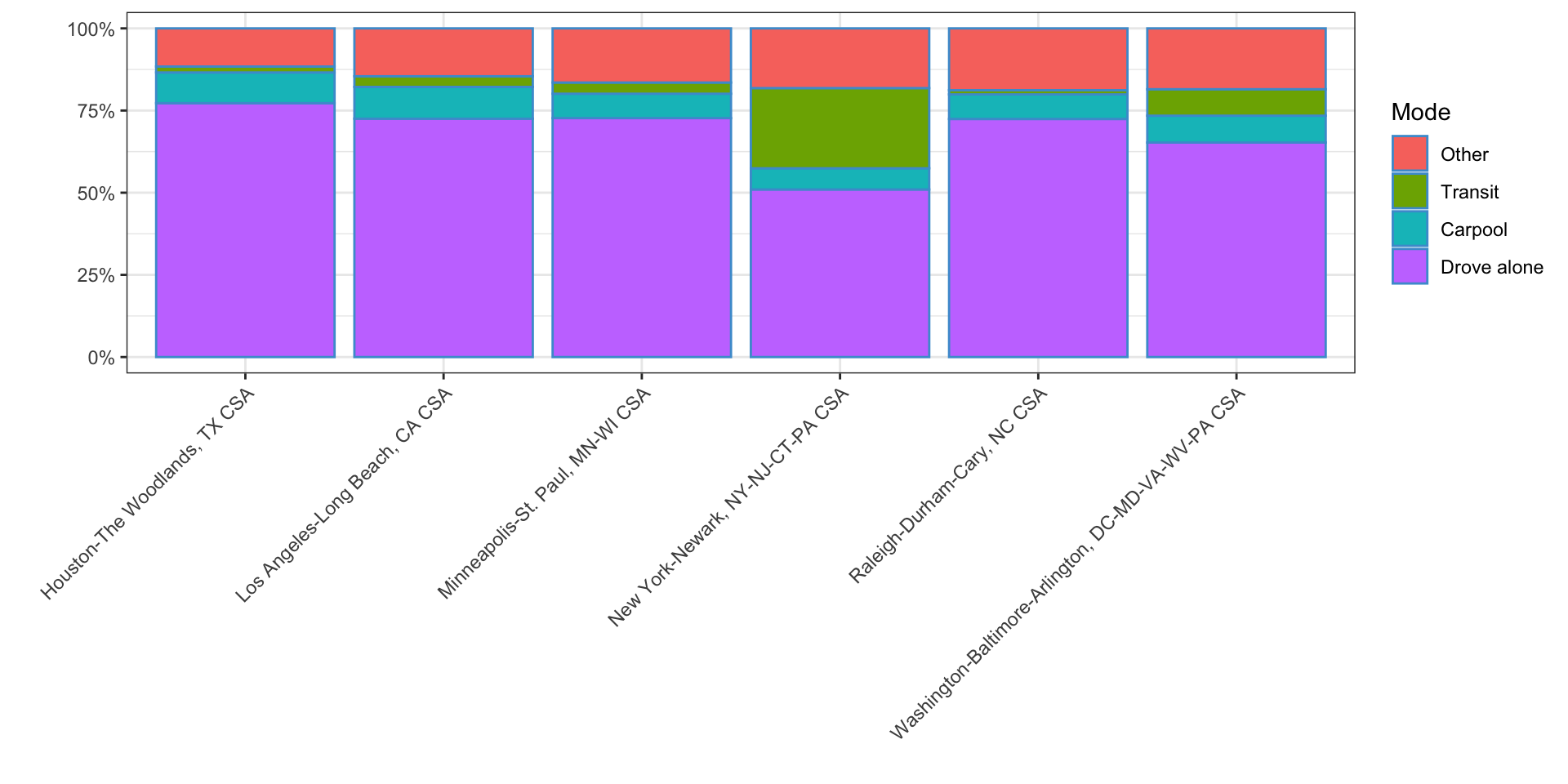
Stacked bar charts
- Often used with percentages but can be used with other things as well
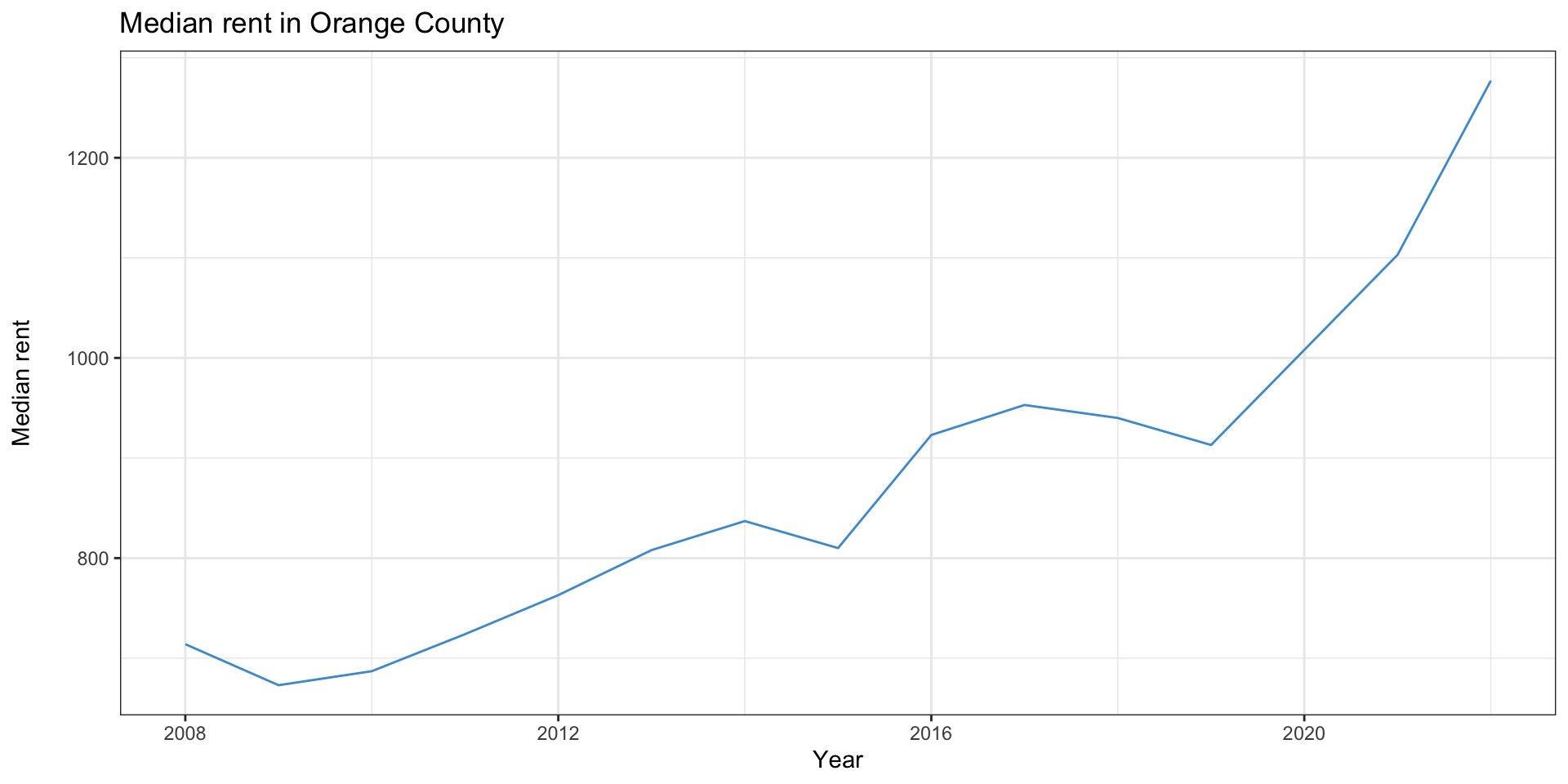
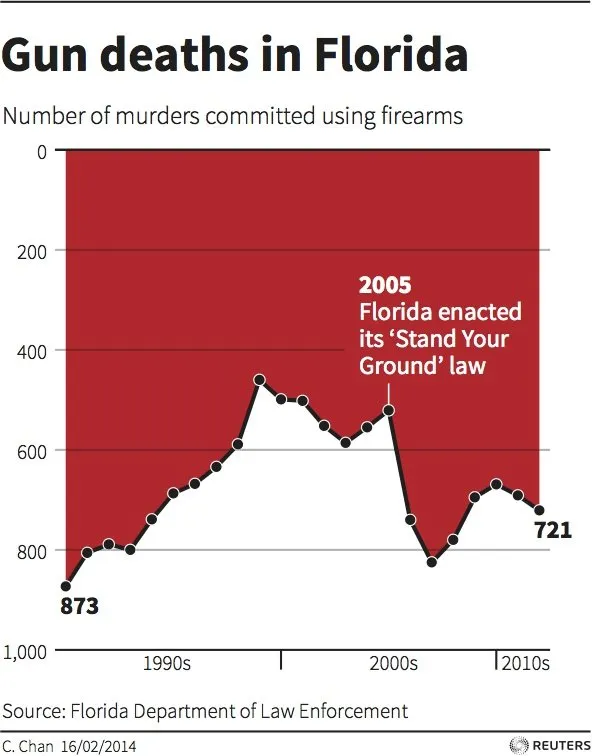
Line charts
- Line charts suggest change over time, so the \(x\) axis should always be time
- This graph also shows a common way graphs can mislead
- look at the extents of the \(y\) axis
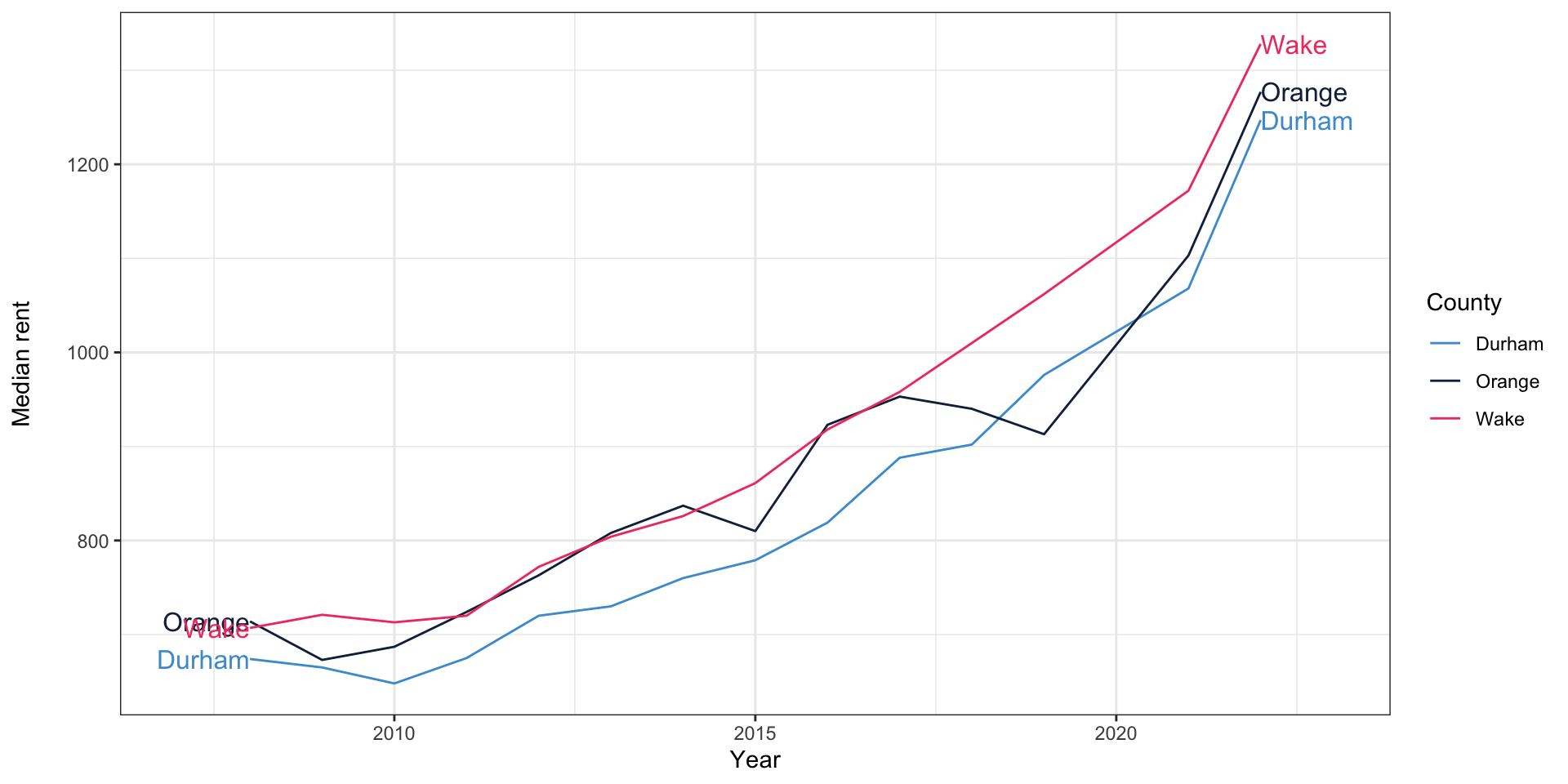
Multiple lines
- It’s common to have multiple lines on line charts
Multiple \(y\) axes
- Occasionally, you’ll even see a graph with multiple \(y\) axes
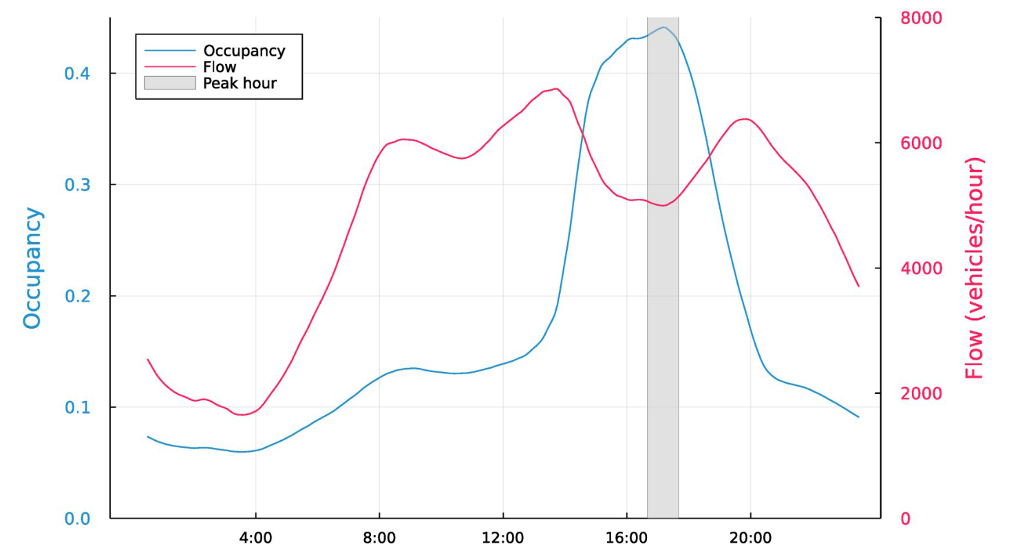
Bhagat-Conway and Zhang (2023)
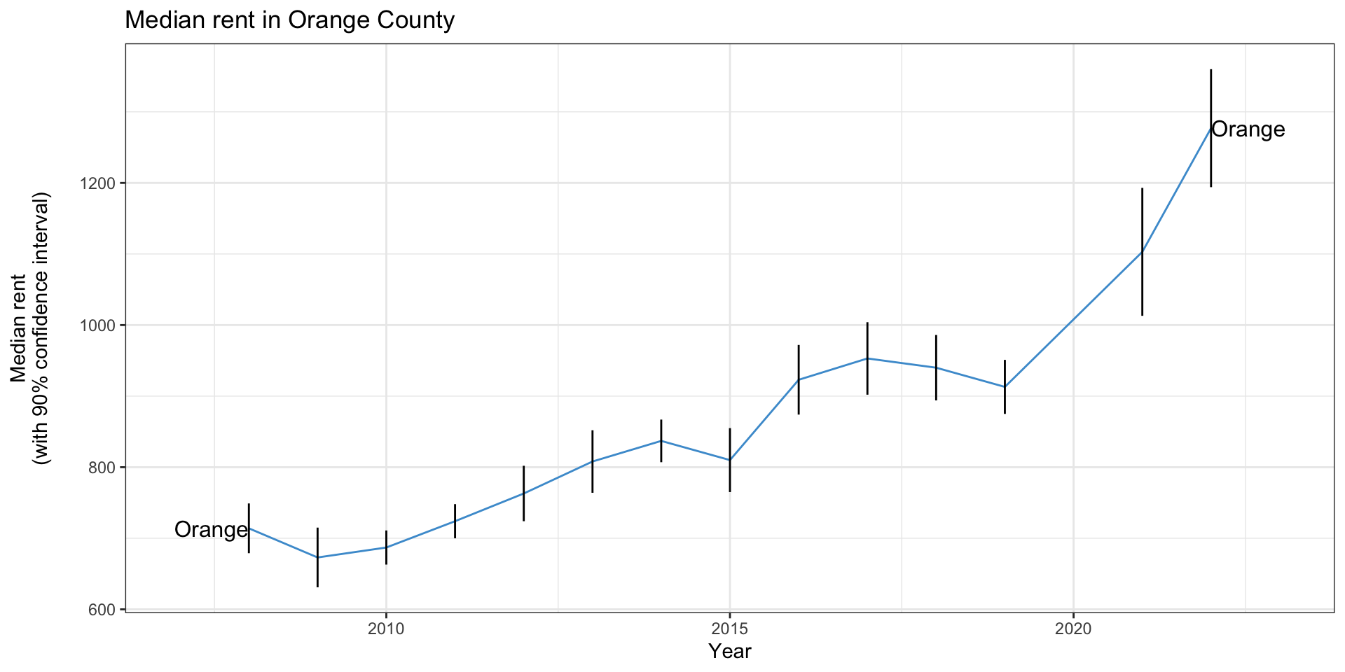
Line charts and error bars
- You’ll occasionally see line charts with error bars on them
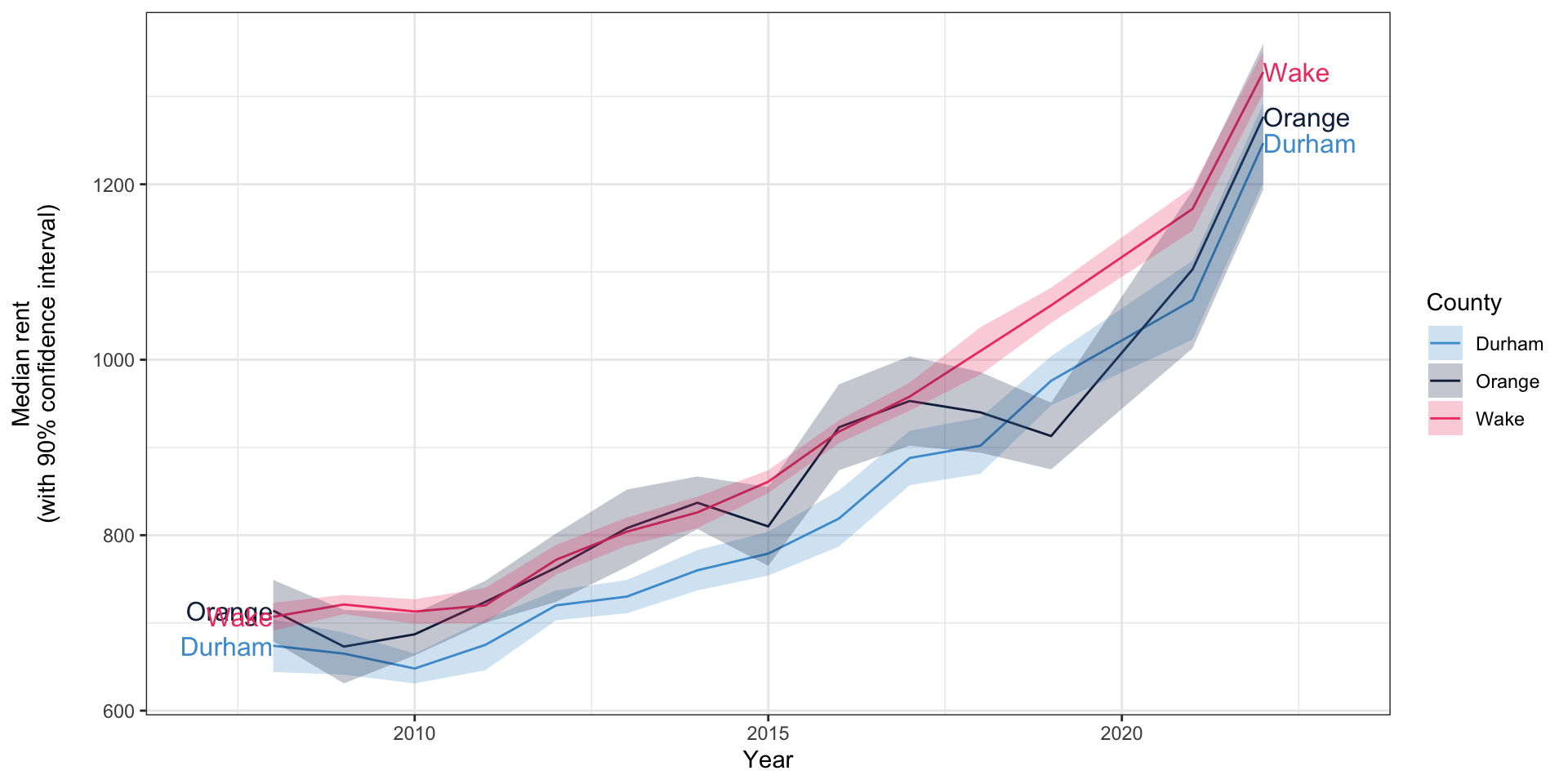
Line charts and error bars
- It’s more common to see line charts with error “ribbons”
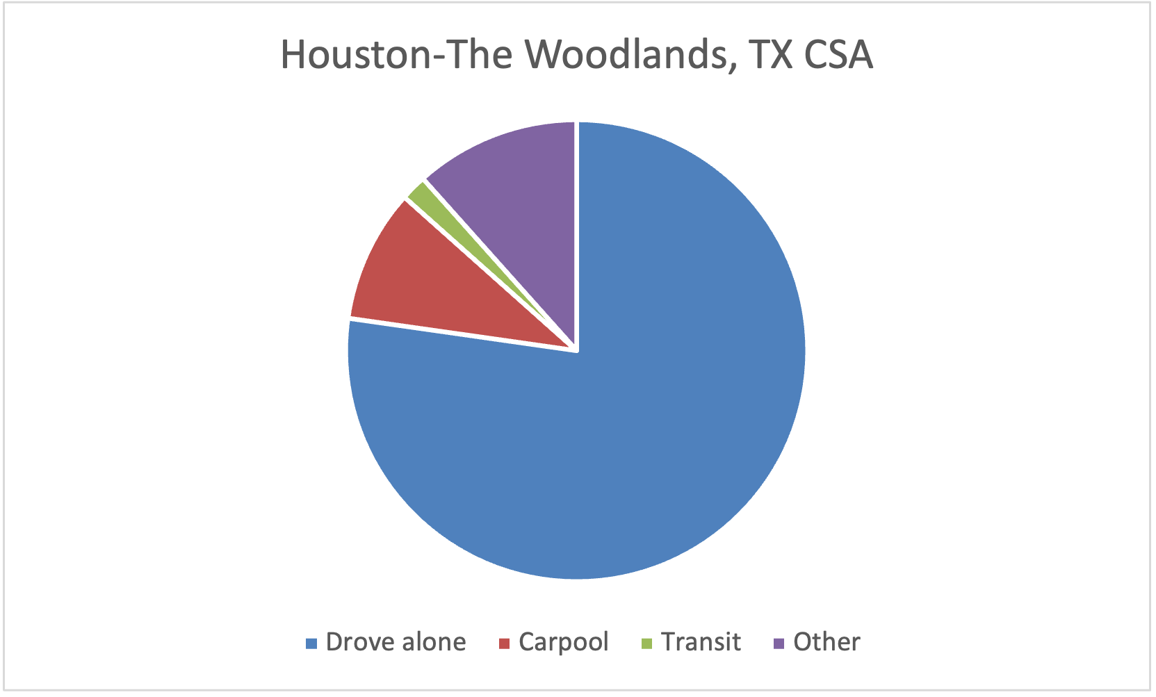
Pie charts
- Pie charts are common in government and business but rare in academia
- Can be hard to compare relative sizes
- Should only be used with data that totals 100%
- Avoid 3D pie charts for similar reasons as 3D bar charts
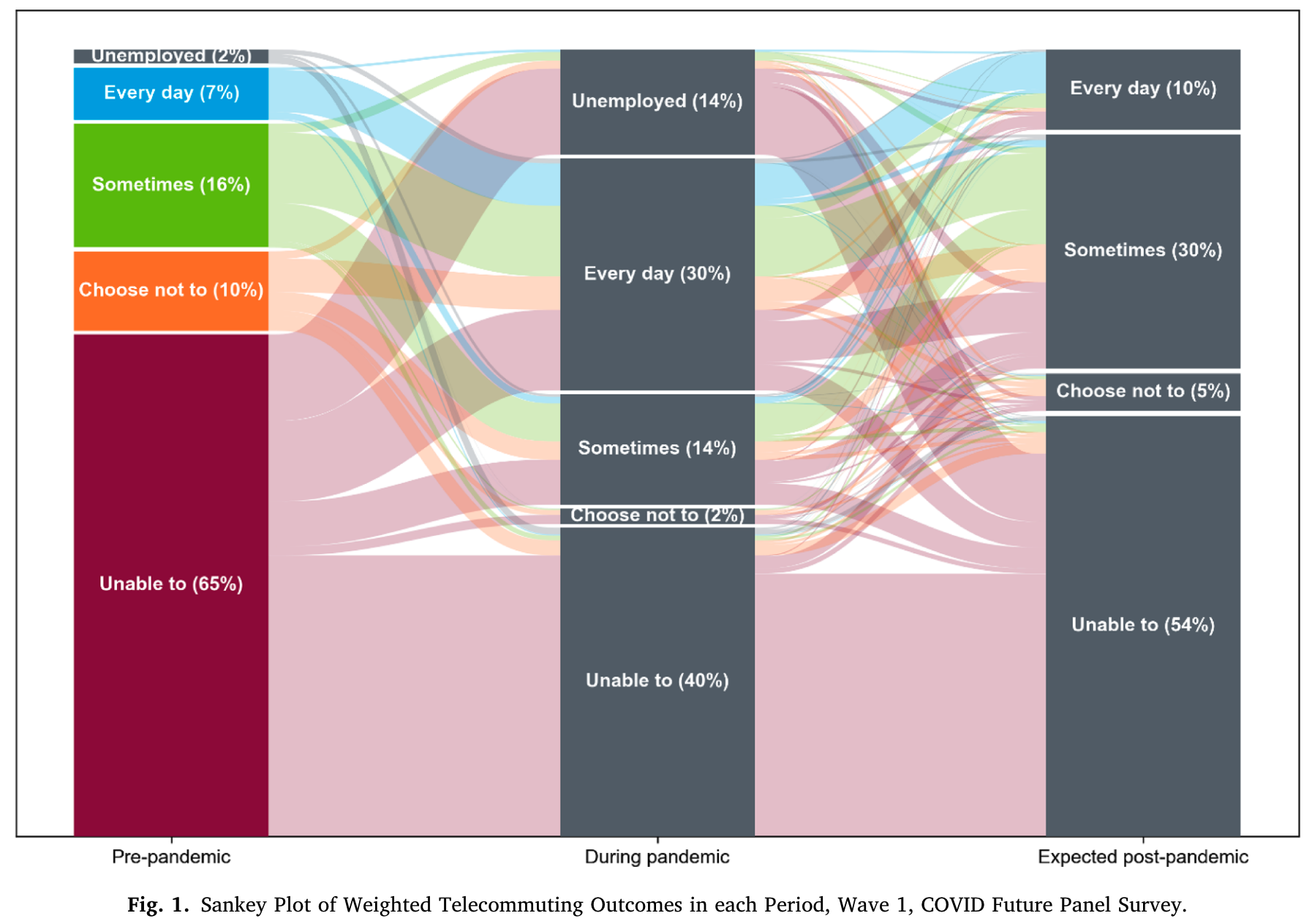
Other gimmicks kinds of charts
- There are lots of other kinds of charts that are occasionally useful
- But probably 95% of charting needs are covered by what we’ve seen today
- It’s easy to get carried away
Accessibility concerns: color vision deficiency

Protanomaly (red-green): less common

Tritanomaly (blue-yellow): rare

Logarithmic (log) scales

Linear scale
Palm and Bhagat-Conway, under review; data: IPUMS
Logarithmic (log) scales

Logarithmic scale
Palm and Bhagat-Conway, under review; data: IPUMS
Logarithmic (log) scales
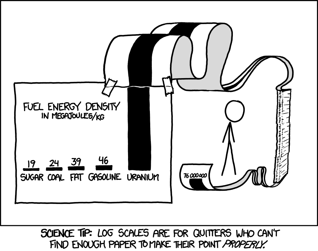
© xkcd
Log-log scales
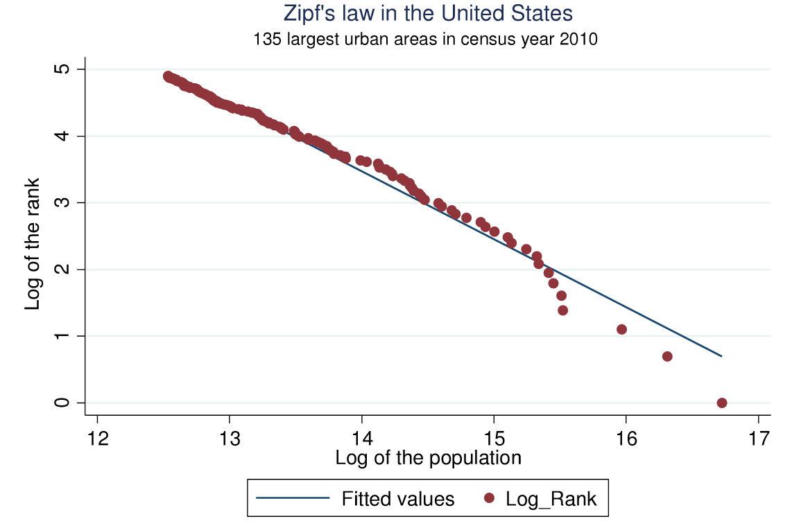
Arshad et al. (2018)
Other ways axes can mislead
More misleading axes
And more…
References
Anscombe, F. J. 1973. “Graphs in Statistical Analysis.” The American Statistician 27 (1): 17–21. https://doi.org/10.2307/2682899.
Arshad, Sidra, Shougeng Hu, and Badar Nadeem Ashraf. 2018. “Zipf’s Law and City Size Distribution: A Survey of the Literature and Future Research Agenda.” Physica A: Statistical Mechanics and Its Applications 492 (February): 75–92. https://doi.org/10.1016/j.physa.2017.10.005.
Bhagat-Conway, Matthew Wigginton, and Sam Zhang. 2023. “Rush Hour-and-a-Half: Traffic Is Spreading Out Post-Lockdown.” PLoS One.
Machado, G. M., M. M. Oliveira, and L. Fernandes. 2009. “A Physiologically-based Model for Simulation of Color Vision Deficiency.” IEEE Transactions on Visualization and Computer Graphics 15 (6): 1291–98. https://doi.org/10.1109/TVCG.2009.113.

This work by Matthew Bhagat-Conway is licensed under a Creative Commons Attribution 4.0 International License.
